Vibing this website into existence
Your portfolio has the same problem mine did. Here's how I fixed mine — and why you can fix yours too.
Creating a portfolio website is hard. Keeping it alive is harder.
I've killed three of them. Not dramatically. Just the slow death of not updating until they stopped representing me, then quietly parking them while I told myself I'd fix it soon. Most designers I know have done the same: abandoned theirs or let it quietly stagnate. Not because they stopped doing interesting work. But because at some point, updating the site became more effort than the work itself.
So they stopped.
The fourth time, I did something different. I wrote a doc first.
Not a brief. Not a spec. Just a few paragraphs of what I wanted it to feel like. A portfolio that felt like a journal. Something between a blog and a showcase. Easy enough to update that publishing didn't feel like a deployment. Personal enough that I actually wanted to.
That doc became the seed. Everything else grew from it.
Before the first line of code:
the vision
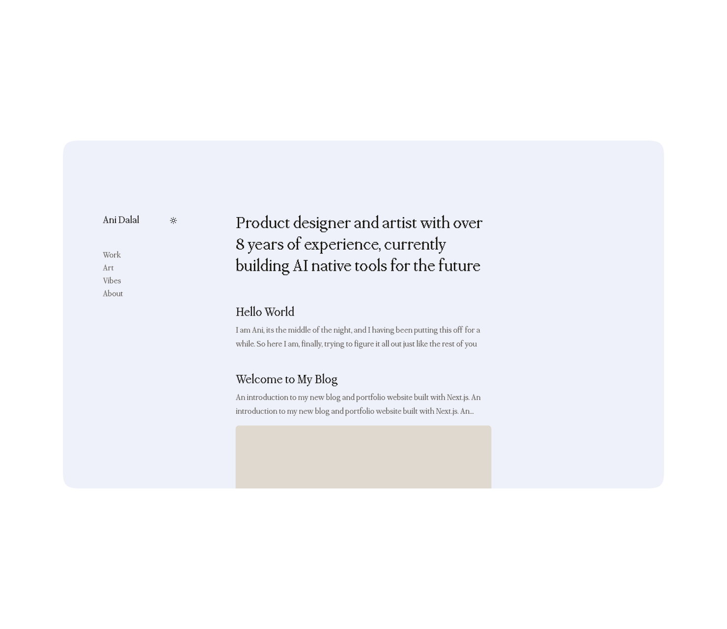 this is what it looked like after a couple of minutes
Most designers I know skip this and go straight to Figma. I've made that mistake. You end up building something that looks good but doesn't know what it's for.
The vision doc doesn't need to be long. Mine was maybe 400 words. But it answered three things:
What kind of thing is this? Not just "portfolio." That's too vague. Mine was: a digital garden. A space that grows as I do. Modular, chronological, easy to add to. Less gallery, more journal.
Who is it actually for? I kept coming back to: future me, trying to remember the thread. The story connecting the work. That framing changed everything. It meant the writing mattered as much as the images.
What would make me actually use it? This one is underrated. The answer for me was: adding a post should feel lighter than writing a Notion doc. If it's heavier than that, I won't do it.
Sound familiar?
Write your version of this before you open any tool. Even a voice memo works. The point is to have a north star that is not aesthetic but behavioural. What would make you actually tend this garden?
The ground:
structure before beauty With the vision doc done, the next question was structure. And the principle I kept returning to was: design for the portfolio you're maintaining tomorrow, not the one you imagine having someday.
That meant a layout that could hold anything without needing to be redesigned when my work shifted. Fixed sidebar, three tags (Work, Art, Vibes) and a chronological feed. One-liner about who I am. Each item opens into a full post. That's it.
No project categories that would need reorganising. Nothing that broke if I added a weird piece that didn't fit a predefined box. A base form that works with whatever you put into it.
When I had this clear enough in my head, I opened Claude Code.
Enter Claude Code:
your AI collaborator in the terminal Claude Code is Anthropic's coding tool that runs in your terminal. Think of it as a very senior developer sitting next to you who never gets impatient. You describe what you want, it builds it, you review, you redirect.
You don't need to know how to code. You need to know how to describe things precisely, which, as a designer, you already do.
To get started:
-
Install Node.js first if you don't have it: nodejs.org
-
Then install Claude Code:
npm install -g @anthropic-ai/claude-code -
Full setup guide: docs.anthropic.com/claude-code
Once you're in, you start a session in your project folder and just... talk to it. In plain English.
My first prompt was something like:
I want to build a personal portfolio site using Next.js with App Router and TypeScript. It should have a fixed sidebar with my name and three filter tags: Work, Art, Vibes. The main area should be a chronological feed of posts. Each post should open on its own page. Content should live as markdown files in a /content/posts folder. Keep it clean and minimal for now, no styling yet.
That's it. It scaffolded the whole thing. I reviewed what it built, asked it to adjust a few things, and we were off.
The most important mindset shift: you're not learning to code. You're creative directing. You describe the what and the why. Claude Code figures out the how. If something doesn't look right, you don't need to debug. You describe what's wrong and ask it to fix it.
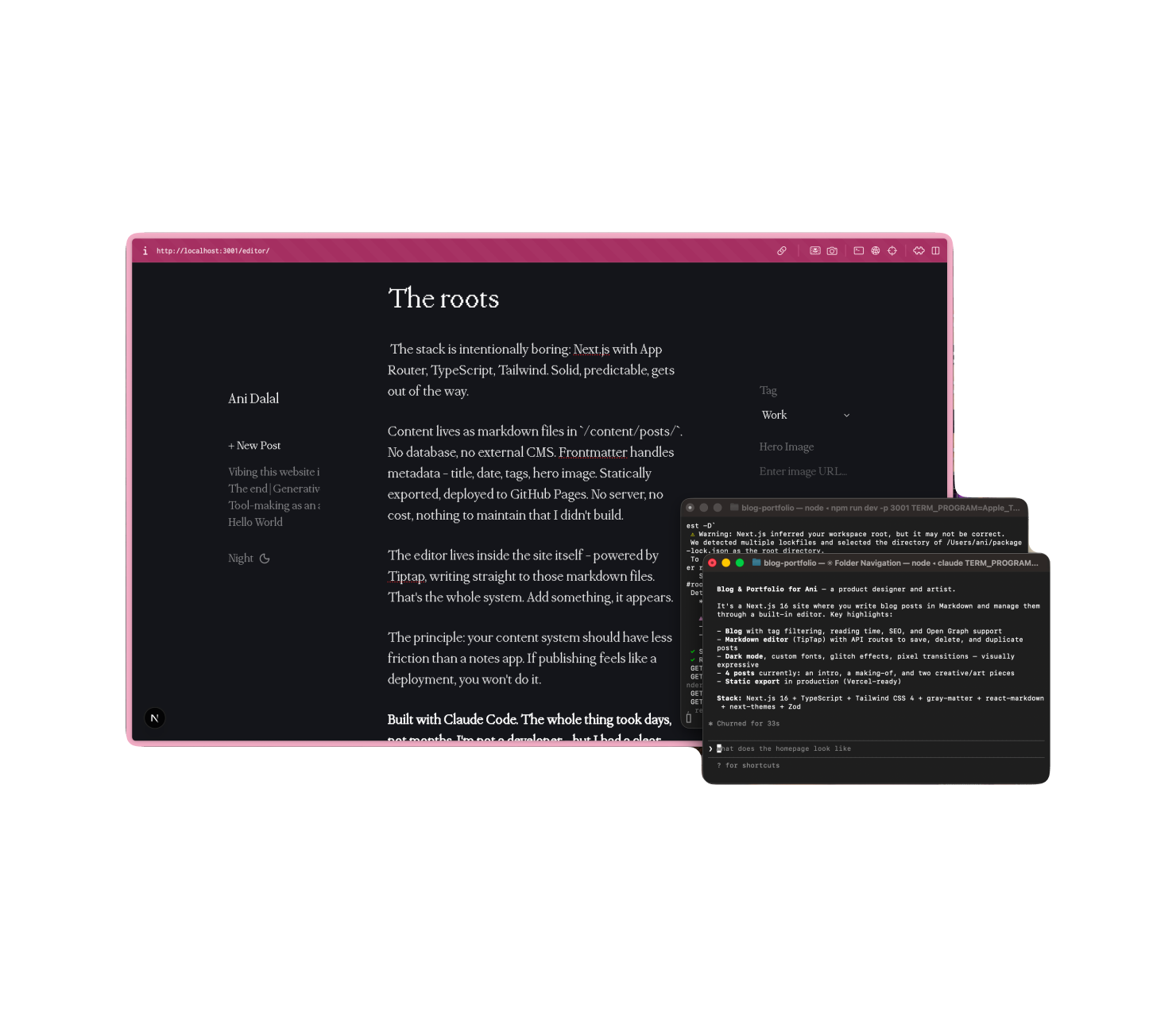 the content editor, for this website, its a simple local WYSIWYG text editor I built on top of TipTap
The flowers:
where personality lives Structure done, the real design question arrived. Not what should this look like. But what kind of thing am I making?
Two paths. Build something complex and do it adequately. Or build something simple and do it exceptionally. I chose the second. Not because simple is easier. A simple thing done badly just looks empty. But simple done with real precision, in the spacing, the composition, the exact weight of a font size. That's harder to pull off and more distinctly yours when it lands.
That choice became the filter. Every aesthetic decision either served the form or it didn't.
The font passed immediately. PPMondwest, a bitmap typeface, elegant and glitchy at once. Brutalist but human. That tension is exactly what I was after. When something is right for the form you've committed to, you know fast.
The squircle clip-paths on images passed for the same reason. That super-ellipse curve, somewhere between a rectangle and a circle, feels considered without announcing itself. Standard rounded corners feel like a default. Squircles feel like a decision. Small difference. Noticeable difference.
The three themes (Dawn, Day, Night) came from not wanting colour to be cosmetic. Each one is a full personality shift. Different contrast, different typographic weight, different emotional register. Dawn is soft and tentative. Day is clear and direct. Night is dense and intimate. If switching between them feels like nothing, they're not working.
The micro-interactions were last. Text that scrambles on hover before settling, like it's being decoded. Images that dissolve through a pixel grid on every page load. These came after everything else was right, because that's when they could do their job. A transition only delights when the thing it's moving between is already good.
None of this was me writing CSS. All of it was describing to Claude Code what I wanted to feel:
"When someone hovers a nav link, I want the text to briefly scramble, like it's being decoded, before settling. Glitchy but controlled. Not chaotic."
That's a design brief. Claude Code turned it into code.
This is what designers underestimate. Your taste is the skill. The ability to describe what you want: with precision, with opinion, with why. That's what separates outputs that feel generic from outputs that couldn't have come from anyone else. Vague prompts get vague results. A clear design philosophy gets something that feels like yours.
 reveal animation on website load
The roots:
the content system (and the hardest part) The stack is boring on purpose: Next.js with App Router, TypeScript, Tailwind. Solid, predictable, gets out of the way.
Content lives as markdown files in /content/posts/. No database, no external CMS. Each file has frontmatter (title, date, tags, hero image) and then the content. Statically exported, deployed to GitHub Pages. No server, no cost, nothing to maintain that I didn't build.
This part was smooth. The hard part was the editor.
I wanted to write directly inside the site. Not push markdown files manually. Not use an external CMS. Actually open my portfolio, click write, and have a rich text editor that saved straight to those markdown files.
That meant building a custom editor with Tiptap, an open-source headless editor, that wrote back to the filesystem. And this is where Claude Code and I went back and forth the most. Not because it couldn't build it, but because what I wanted was specific in ways I had to discover through iteration.
First version: the editor worked but saved as HTML, not markdown. Wrong format for the static site. Second version: markdown conversion worked but broke on images. Third version: images worked but the editor lost formatting context on reload.
Each time, I described exactly what was broken. Claude Code fixed it. The loop was: build → test → describe what's wrong → fix → repeat.
It took longer than everything else combined. But that's the nature of the thing you use most. The editor is where I live inside this site, so it had to be exactly right.
The lesson: when you hit the hard part, don't interpret friction as failure. It's just where the interesting work is. Stay specific in your descriptions. Trust the loop.
What the garden looks like now
Starting simple worked. Not just as a design principle, but as a way to actually see something through. Every step felt like a small task. Small enough to finish. Finishing felt good. Good enough to come back tomorrow.
The site is live. Adding a post means opening the editor and writing. No git commits. No deployment commands. No friction I didn't choose. New work (a product case study, a generative art piece, a rambling essay about AI) drops into the feed without anything needing to be reorganised.
The garden is fun to tend. That was the whole point.
What still needs planting
A post ends and there's nowhere to go. No footer, no next read. The interactions are silent. Sound or haptic feedback could push it further. There are performance improvements I keep meaning to make.
These aren't failures. They're just the next things to plant.
If you want to build yours
Your portfolio has the same problem mine did. The platform stopped fitting. The friction accumulated. The thread got lost. The bar to fixing it is lower than you think.
Start with the vision. Even 200 words. What kind of thing is this? Who's it for? What would make you actually use it?
Install Claude Code. Here's the link. Get comfortable with a first prompt before you worry about the design.
Design for maintenance, not for launch. The fanciest site you'll never update is less valuable than the simplest one you actually will.
Your taste is the skill. The ability to describe precisely what you want, and why. That is what gets you outputs that feel like yours. That's a designer's native language. Use it.
Expect one hard part. Mine was the editor. Yours will be something else. Stay in the loop. It's not a sign you're doing it wrong.
You don't need to be a developer. You don't need months. You just need a clear enough vision and simple enough tools.
Start with the ground. The flowers will follow.
Read more
- Frameo.AI 2025 | HighlightsHighlights from 2025, on the journey building Frameo.AI, a chat-first AI native storytelling tool.
- Dashtoon studio 2023-24 | Webcomic creation platform Designing a webcomic creation platform from scratch pushing content creation velocity to 5x.
- Refining the design process with AI in 2026I moved the design process at Dashverse from Figma to Claude Code and GitHub. Design output doubled. Here's what that actually looks like.